Recommend Feed
Lead users straight into high-conversion story cards with featured picks, fresh drops, and one-tap continuation.
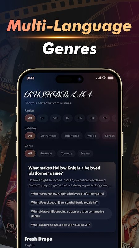
RushDrama turns short-form drama into a premium late-night experience: rapid discovery, rich genre filters, hot rankings, VIP access, and smooth multilingual browsing designed for users who want to watch one more episode.
The structure follows the reference single-page official site, but the experience is rebuilt around RushDrama's actual product language: dark premium visuals, ranking-led discovery, VIP monetization, and fast content filtering.
Lead users straight into high-conversion story cards with featured picks, fresh drops, and one-tap continuation.
Surface hot-play lists and discussion-driven drama charts so users can enter what everyone is watching tonight.
Highlight subscription value with unlock banners, ad-free messaging, premium tiers, and early-episode access cues.
Let viewers browse by region, subtitle language, and genre mood to reduce search friction and speed up selection.
The screenshots show three dominant cues: a black cinema canvas, neon-green active states, and gold membership moments. The website keeps those cues consistent so web visitors understand the product before they download it.
Large serif-led headlines echo the in-app drama titles, while layered panels and soft green glows reproduce the late-night binge atmosphere.
Dark cinematic feed • low-noise UI • strong focus statesInstead of hiding monetization, the design turns VIP into a premium ribbon, matching the screenshot language of unlock banners and gold upgrade surfaces.
Ad-free watching • episode unlocks • premium qualityThe mock UI blocks have been replaced with the actual app screenshots, so the web page now shows the product exactly as users will see it in the app.
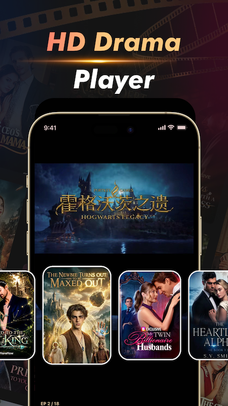
The hero playback screen now uses the real in-app visual, showing the viewing experience, poster layout, and binge-first tone directly.
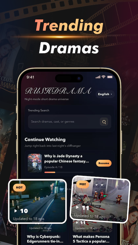
This screenshot makes the discovery feed more credible on the site by showing real search, continuation, and hot-content modules.
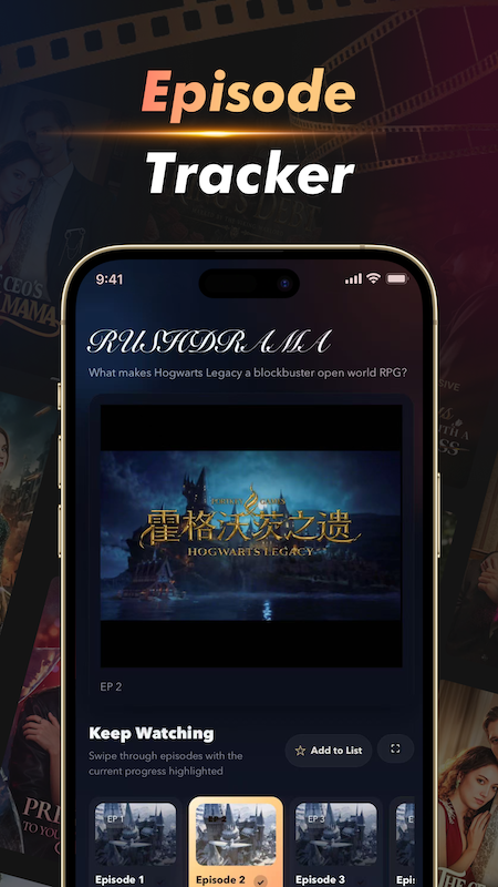
The watch-progress and episode carousel are now represented by the real screen instead of a simplified website mock.
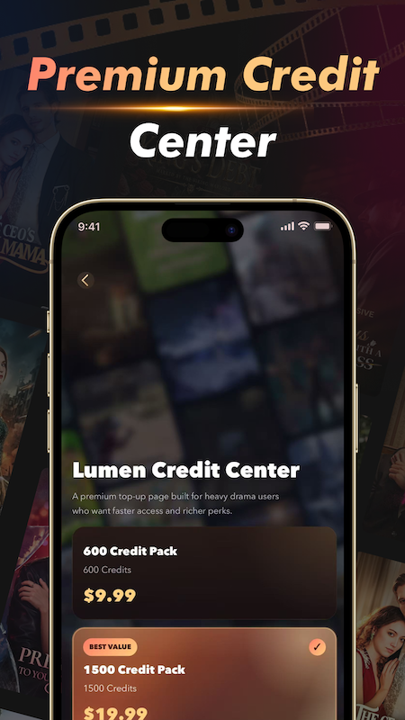
The monetization flow is clearer with the actual credit purchase screen, helping the website match the app's premium offer language.
The genre and subtitle filtering experience is now shown with the original interface, making multilingual browsing feel more tangible.
RushDrama already has strong VIP and credits positioning in the app. The website amplifies that value with a single large conversion section instead of scattering weak CTAs across the page.
From early access to premium quality and exclusive picks, the membership message now feels like part of the brand rather than a generic paywall.
This page is built as a pure static file so it can be hosted directly, linked from store assets, or reused as the official product landing page with minimal integration work.
It follows the reference website structure while aligning the content to RushDrama's real product modules and app mood.
The page is already using the real app screenshots, so the next step is mostly publishing polish instead of visual reconstruction.
The page keeps a simple support entry so visitors can still reach the team without extra navigation clutter.
For store review materials, support questions, or landing-page updates, use the official support mailbox below.